Workshop black
#050505

Selected work / 03
All projects
03 / Reece Reid
The brief
Reece needed more than a name on a van. The identity had to feel energetic, memorable and unmistakably connected to the craft—then hold together at full scale in the real world.
The direction
Most local trade branding disappears into the same familiar visual language. Reece Reid needed the opposite: a fast, expressive system that could be recognised at a glance from across the street.
The identity
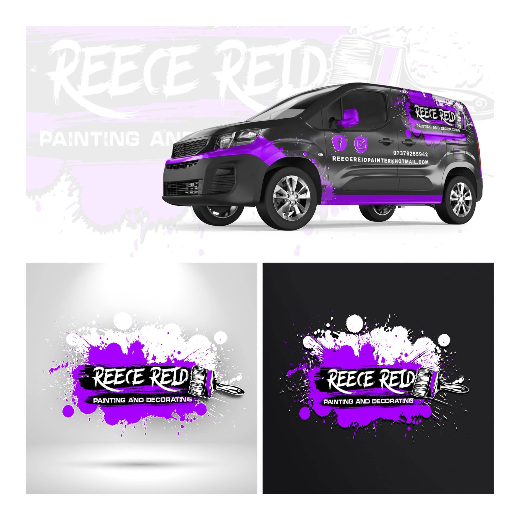
A hand-painted wordmark, brush device and layered splashes bring the service into the mark itself. Electric purple cuts through the black and white palette, giving every application one immediate signature.
 Built to be seen at speed
#050505
#A500FF
#FEFEFE
#29252D
Concept to road
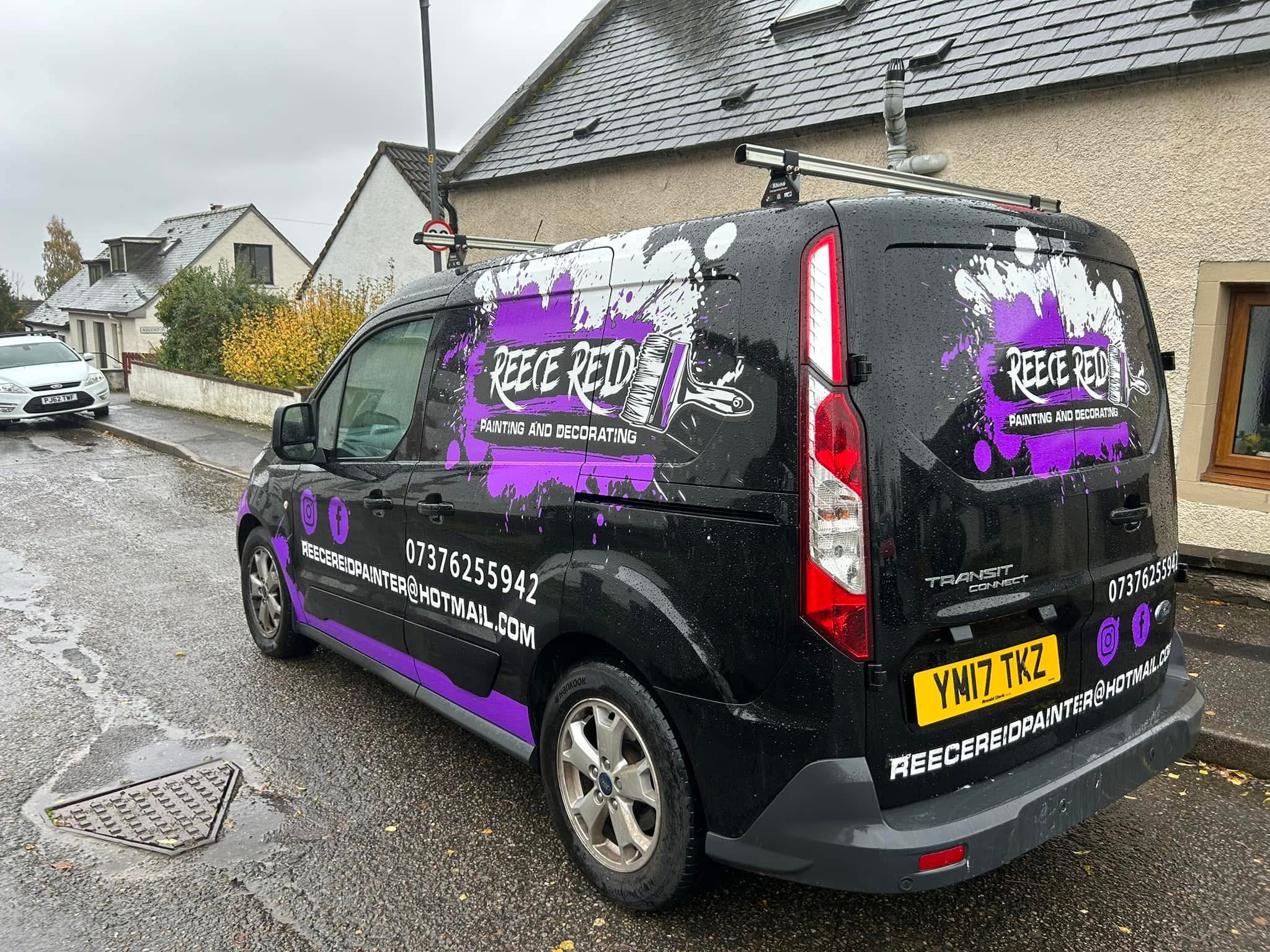
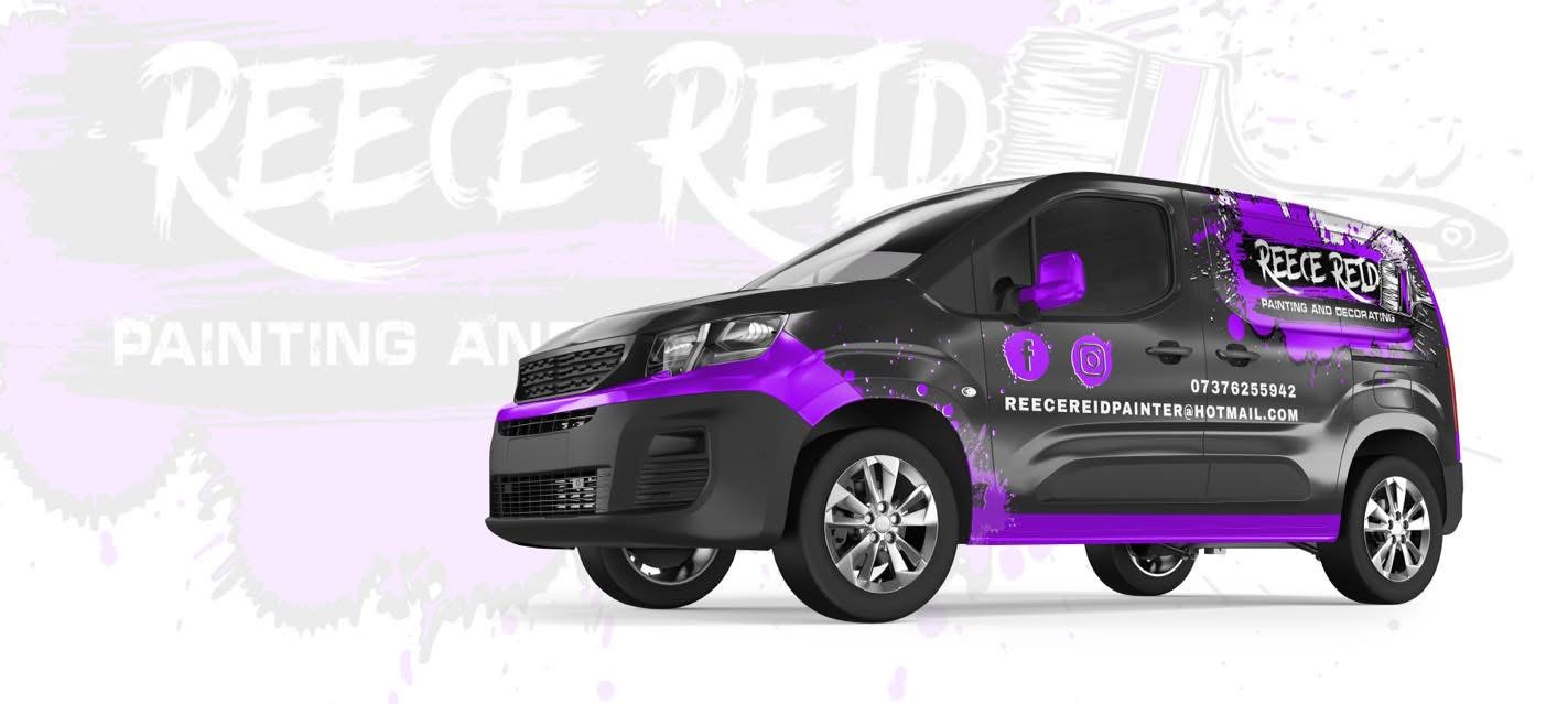
The vehicle was treated as a complete moving composition—not a logo placed on a door. Paint movement leads the eye across the bodywork, while the service name and contact details stay direct and readable.
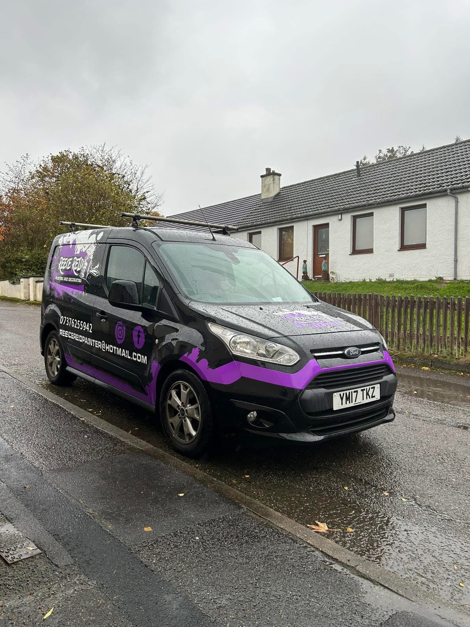
On the road
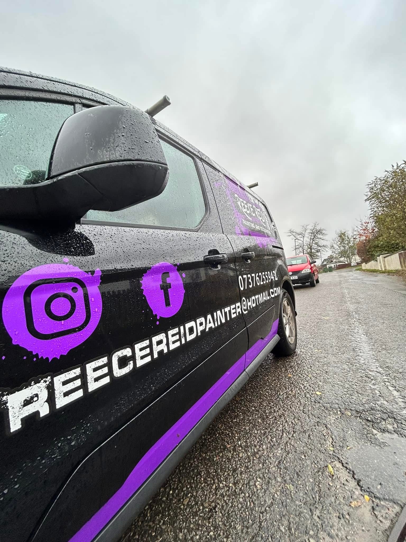
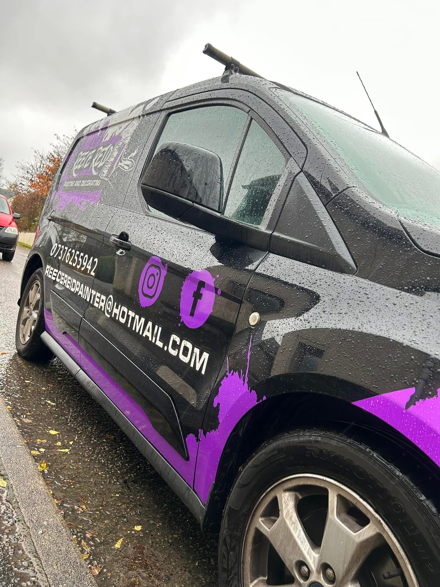
The system
Light and dark versions keep the identity flexible without losing the paint-led character. The same recognisable language can move from a vehicle to workwear, social content and future materials.
The result